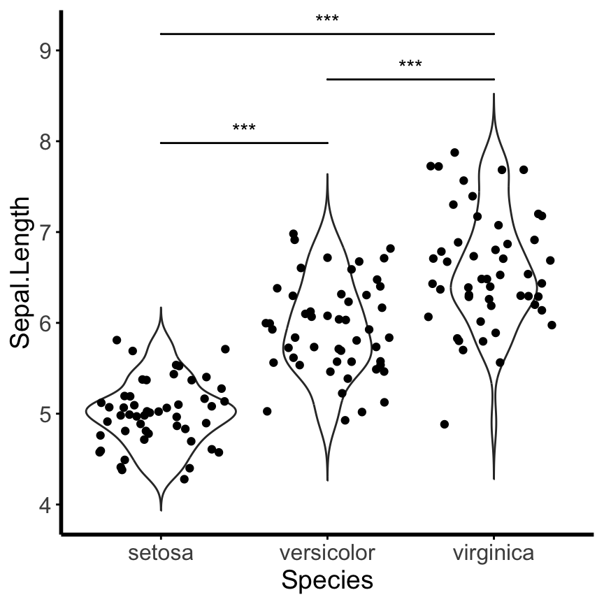
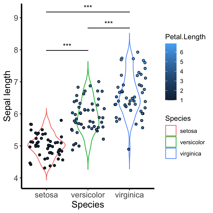
Install the GGally, ggpubr, and ggsignif packages
install.packages(c("GGally", "ggpubr", "ggsignif",
"viridis", "scales", "viridisLite",
"survival", "survminer", "ggalluvial",
"stringr"))
library(GGally)
library(ggpubr)
library(ggsignif)
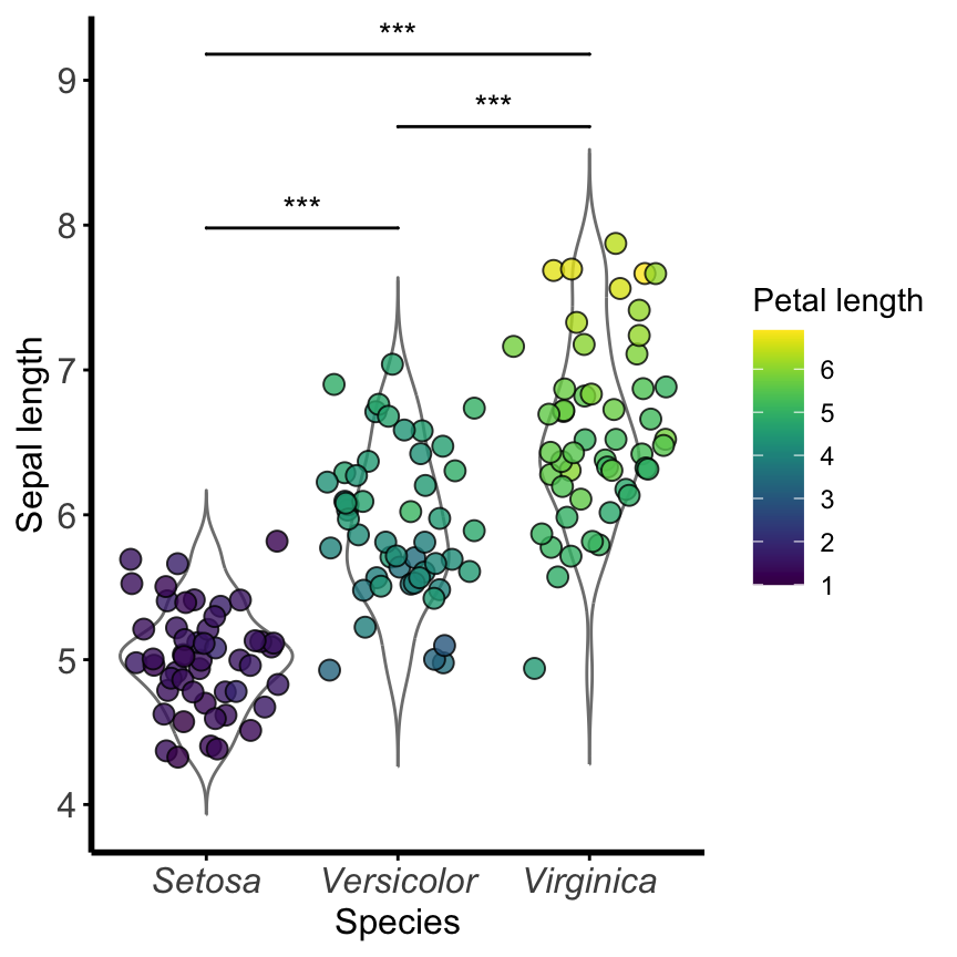
library(viridis)
library(scales)
library(viridisLite)
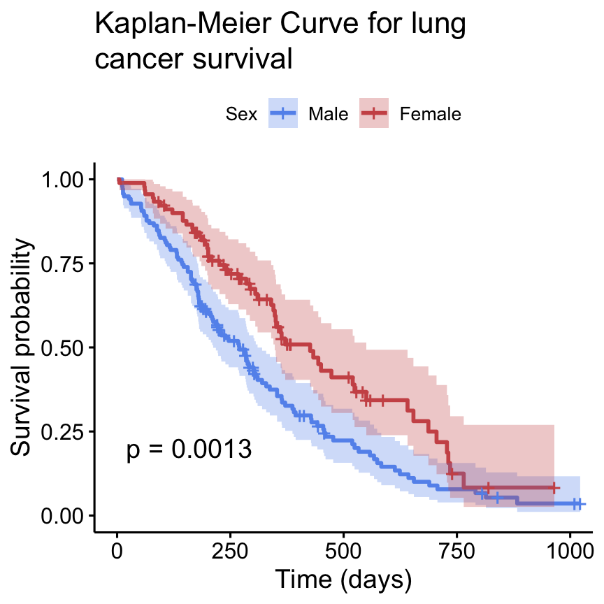
library(survival)
library(survminer)
library(ggalluvial)
library(stringr)